
 And now for something completely different. I offer for your consumption two links to photo sites that will make you look at fast food - and the refuse it produces - in a new way.
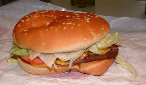
Let’s start with Fast Foods: Ads vs. Reality. Have you ever been served a take-out meal and thought, ‘Wow – that doesn’t look anything like what I saw in the TV ad!’ Click on the photo sequence at right to see what I mean. The Whopper in the promo pic (top) sits high and proud, with a dandy looking meat patty, light, fluffy bun and colourful lettuce and tomato. The actual burger (bottom) lacks colour, the bun is flat and lifeless and the stuff in the middle looks far less appetizing. There are several other great examples of fast food on this site that fail to deliver on the visual promise, a demonstration of the important role that food stylists play in the marketing of food. (Food stylists being those peculiar artisans who sculpt, spray, arrange and present food to its maximum visual effect, before the photographer starts shooting. Digital retouching does the rest.)
“Each item was purchased, taken home, and photographed immediately,” says the introductory blurb at the site. "Nothing was tampered with, run over by a car, or anything of the sort. It is an accurate representation in every case."
The quality of photography on the site is strictly amateur, but it adequately captures the reality of fast food. And I am not looking down my nose at fast food. I do indulge more than I should, and actually love the Whopper, pathetic as it may look here. Right now there are 10 fast food comparisons on the site. I hope they add more. (Caution: The fast food photos are the best thing here; don’t bother clicking around unless you are in the mood for low-brow, foul-mouthed humour.)
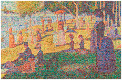
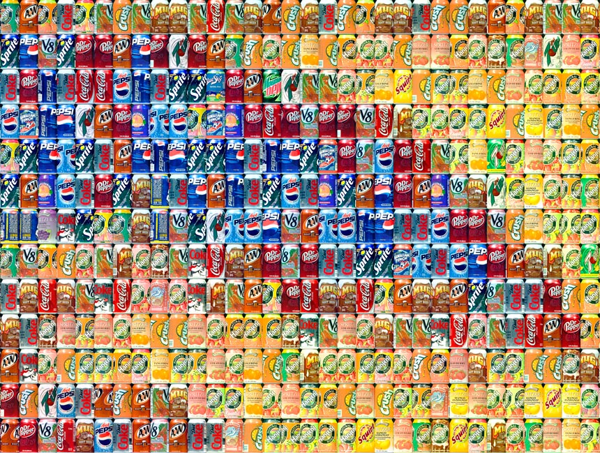
The other link is Running the Numbers: An American Self-Portrait, featuring a series of photo-realistic graphic works by Chris Jordan. In a nutshell, Jordan takes statistics that are normally hard to comprehend and represents them graphically. The piece above, for example, has been created with 106,000 aluminum cans, the number used in the U.S. every 30 seconds. Check this detail, showing just 416 cans, to see how it’s put together.
“This new series looks at contemporary American culture through the austere lens of statistics,” writes artist Chris Jordan. “Each image portrays a specific quantity of something: fifteen million sheets of office paper (five minutes of paper use); 106,000 aluminum cans (thirty seconds of can consumption) and so on. My hope is that images representing these quantities might have a different effect than the raw numbers alone, such as we find daily in articles and books. Statistics can feel abstract and anesthetizing, making it difficult to connect with and make meaning of 3.6 million SUV sales in one year, for example, or 2.3 million Americans in prison, or 426,000 cell phones retired every day. This project visually examines these vast and bizarre measures of our society, in large intricately detailed prints assembled from thousands of smaller photographs.”
I urge you to follow this link and linger for a while. It offers some truly mind-numbing images that will force you to view mass consumerism, and other societal issues, in an entirely new light.
POSTSCRIPT: Ed Hollett has a funny take on today's post over at The Bond Papers. Check it out.


1 comment:
A long time ago someone told me burger places use plastic props for food in their commercials.
Is it wrong, however, that this post just made me want a whopper?
Post a Comment