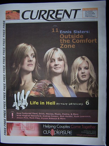
The latest edition of Current – the first under new publisher James Baird – has hit the streets.
And I don’t see a lot to be excited about.
Right off the top, quality control is poor. The writing is spotty – good in some places, abysmal in others – and the editing is slipshod throughout, with an unacceptable number of typographical and punctuation errors.
First, the writing. There is a substantial list of contributors on page three, including some names I recognize. However, only a few have bylines, which is a glaring oversight. There are numerous articles and reviews written in the first person – plenty of “I” and “me” pronouns – but the writers are anonymous. In many cases, such as the cover story, music review, pub story and aikido article, this makes a certain amount of sense because they are poorly written hack pieces. However, the editors should be aware that nationally syndicated columnists like Josey Vogels expect to receive credit for their work.
The problem can probably be traced back to the editor, Baird himself, who had this line in his first editorial: “It will be said that I attempting to relive my youth, other will respond that I have never left it.” Two glaring errors in one sentence! Ouch. Editor, fire thyself. But seriously, a second set of seasoned editorial eyes is clearly what this publication needs.
The magazine has been redesigned, but the look is ho-hum; change for its own sake. The new sans-serif font (Helvetica, I believe) looks cheap and the point size is too large. The image area of each page is contained within a two-point border (even the advertising is contained in the larger box) which prevents photographic bleeds and inhibits creative layouts. As an example, ‘Clarkes Beach’, a new graphic feature by artist Robert Clarke-Davis, has some potential but right now it’s boxed, tiny and looking too much like an advertisement. Let it breathe, please! Alas, this conservative new design looks more like a low-budget newsletter than a provocative magazine.
Which brings up the real issue for me. Current is no longer provocative. Yes, it still contains the sex column by Josey Vogels, but that’s it. They’ve dropped the column on gay issues, presumably alienating 10 per cent of the readership, and sanitized the language. Meghan Beresford is still listed as a contributor, though I can’t see her byline or unabashedly frank – and highly entertaining – writing style.
Most importantly, there are no more controversial, funny or breaking news stories on page three. According to media interviews given by James Baird, the paper is moving away from that sort of coverage. There will be no more of the nastiness and controversy; a lot more arts and entertainment coverage.
That’s fine, if we are given penetrating and insightful arts coverage. Thus far, we haven’t seen that. For example, the cover story on the Ennis Sisters is lightweight filler that ignores the meat of the story. What about the relationship between the Ennis Sisters and their record company, which I hear is strained at times? Why is their new CD only available on the tour, but not in stores? These are questions that the old Current would have asked. (And I am not criticizing the Ennis Sisters in any way. I like them. That’s why I am interested in hearing the real story, not a fluff piece.) I am not even going to mention that odd, almost incomprehensible sidebar, in which the sisters offer quick answers to apparently random questions, such as this reply to 'How Deep is Your Love?':
“Karen’s is miss safety net one of empathic compassion with everyone at a distance, whereas Maureen is the drama queen where everything is an extreme it is either the absolute best or so bad.”
Am I coming down too hard on the paper? I don’t think so. Though some of the credited pieces are okay, there really isn’t anything here that I would offer as recommended reading, and much that made my brain hurt.
The previous publishers – at various times Tom Thorne, Mark Smith, Roger Bill and Greg Locke - worked hard to make Current a truly entertaining, probing and unpredictable read. I didn't always agree with everything they cranked out, but I respected what they were trying to achieve, which was a true Newfoundland and Labrador "alternative".
This is the legacy that James Baird bought into. He knew that everyone would be watching the next issue closely and that he couldn’t afford to come out with an inferior product. Yet, that is exactly what has transpired.
I am hoping for better, much better, in the next edition.


3 comments:
Hey Geoff, I completly agree with you. I read the current in the past. It was fun, provocative and sometimes a little over the top. It was not pretending to be anything but the above. Not sure what the new current is supposed to be: mixture of Scope and Town Cryer?? Begs the question
The old Current had its downfalls. It had a seemingly random design, and Roger Bill would tell you himself that many of the the photos were "liberated from the Internet."
But what Current always had going for it was its edginess. Current had guts. It was funny, gutsy journalism. If it doesn't have that, then it doesn't offer anything original.
The new style risks alienating its readership. I wouldn't be surprised to see it sink out of the black.
Post a Comment